DATA FILTER
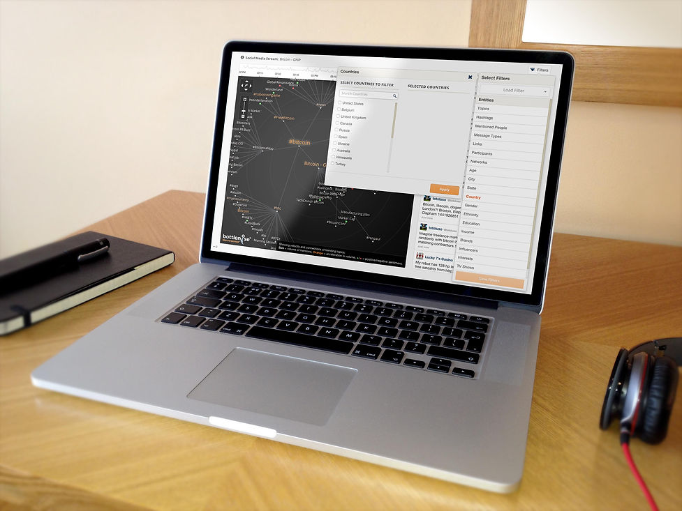
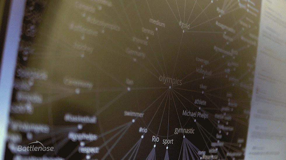
The Data Filter is a data segmentation tool that gives Bottlenose users the ability to find, segment, and save focused data.
80% adoption by targeted users
10% increase in monthly revenue from subscription seat counts
The process
The Challenge:
Bottlenose wants to increase its monthly subscription seat count revenue by creating a feature that appeals to executive level users
The Solution:
Design and build an analytics tool that gives Bottlenose executive users the ability to easily find, segment, and save focused data without having to rely on data scientists and analysts.
01 Strategy
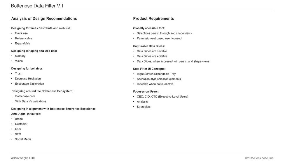
Requirements
To start, our product team had a few educated ideas about what the data filter should be. I worked with them to create an initial product requirements document, which included these ideas. In addition, I gathered information from stakeholders (product managers, developers, management) about expectations and how success would be defined. This helped me draft a qualitative survey for our target users that addressed stakeholder expectations.
Deliverables:
Product Requirements Document
Qualitative Client Survey
02 discovery
Establishing a Baseline
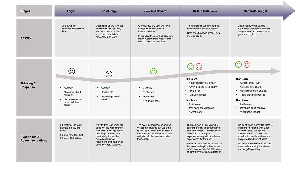
I started by joining our sales team on their regular visits with the executives and analysts of our client organizations, and used these opportunities to develop my own relationships with them. Through interviews and the survey, I was able to collect a lot of data about their experiences, needs, goals, and behaviors. Later, these relationships would also be invaluable for usability sessions. Additionally, I was able to conduct evaluative user tests to shed light on what aspects of the software seemed to best serve the clients. From this I created a Retrospective Journey Map.
Deliverables:
Affinity Diagram
Client Survey Results
Competitive Analysis
Retrospective Journey Map
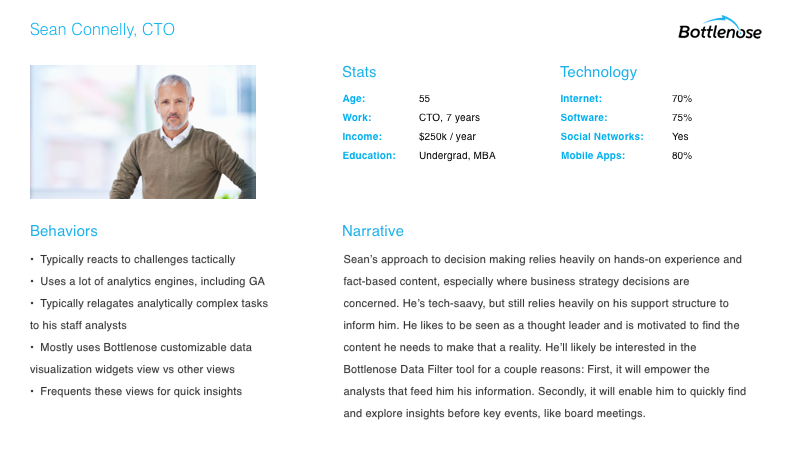
Personas or Target Users
03 definition
Putting the Pieces Together
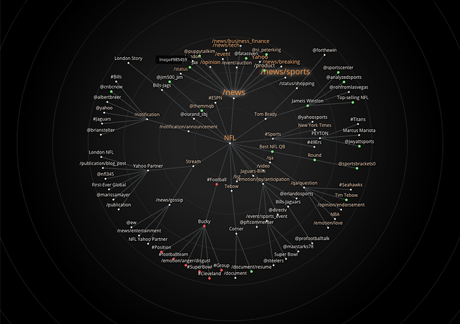
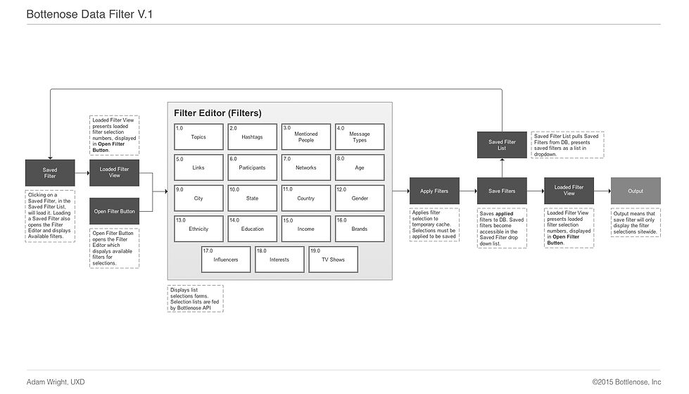
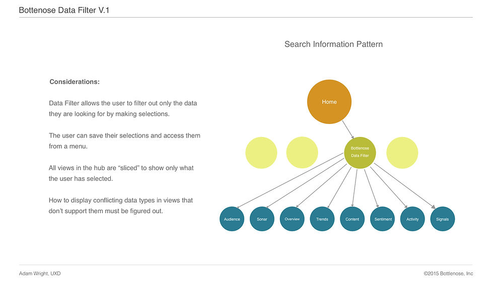
In this phase, I worked closely with our engineers and data scientists to define acceptable parameters based on what was functionally possible. I produced architecture diagrams and user flows based on what I learned in the Discovery phase and technical limitations.
Deliverables:
User Flow
Information Architecture
Information Schema
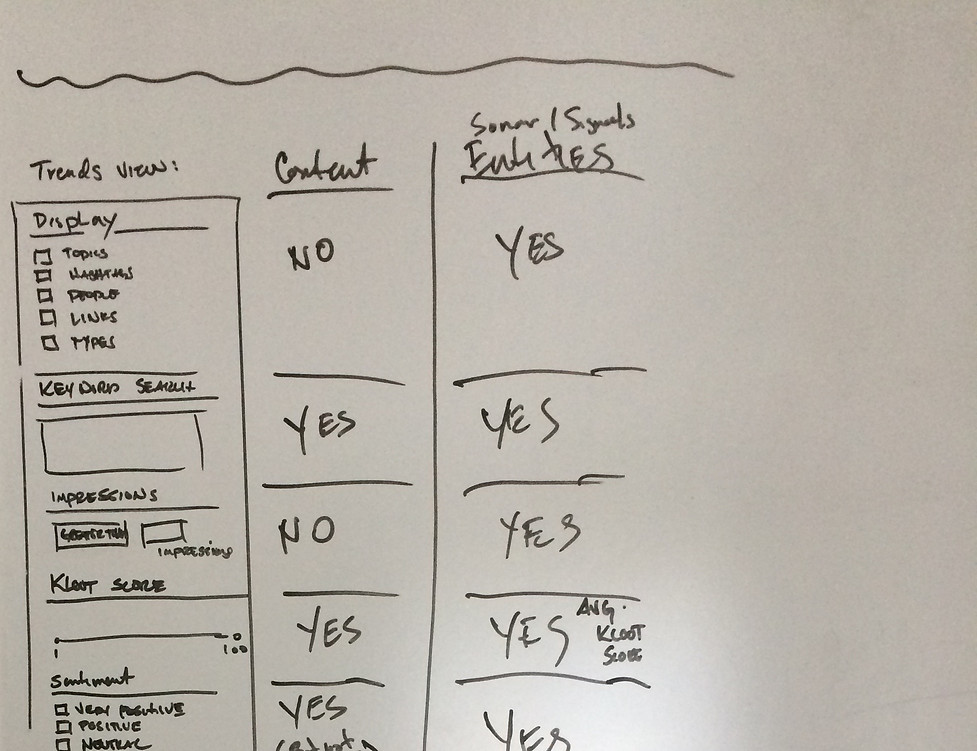
04 IDEATION
Sketching It Out
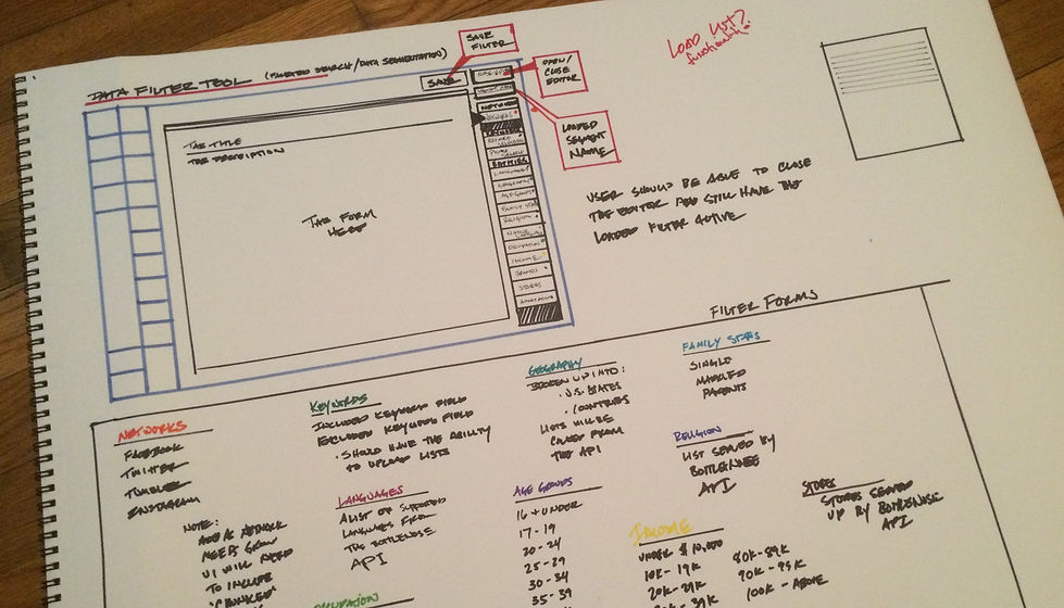
In this phase, I sketched out initial ideas about what the experience should be based on what I learned from the previous two phases. These sketches included both blocking and layered blocking considerations.
Deliverables:
UI Sketches
05 design
Functional Design
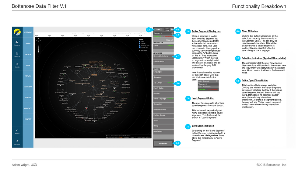
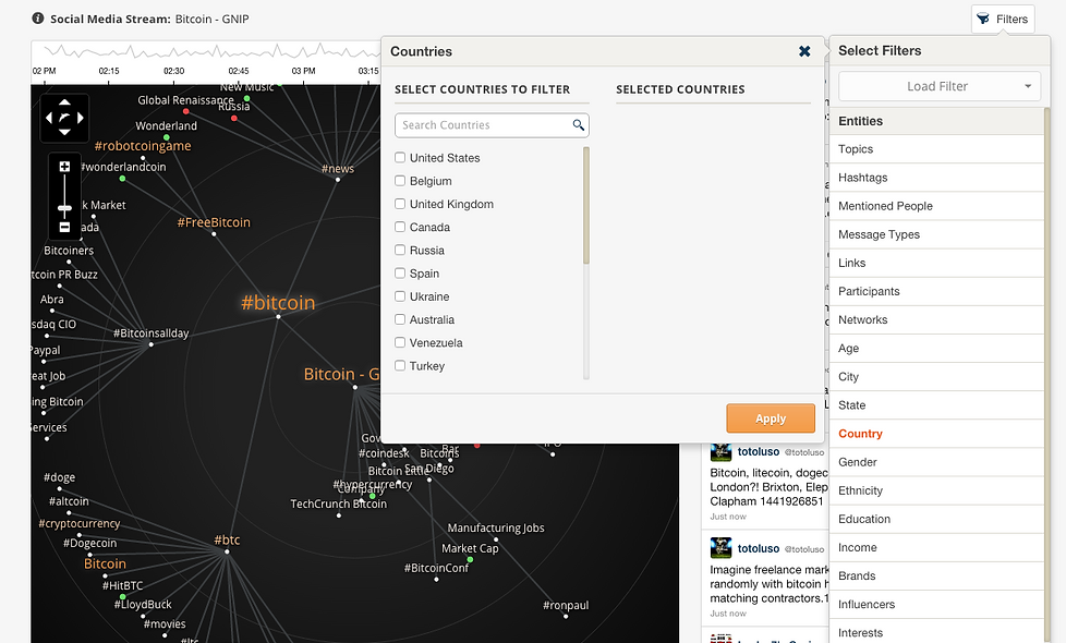
I created a series of annotated wireframes that illustrated the basic interactions of the tool. For the final design, I worked within the parameters of the Bottlenose Style Guide.
Deliverables:
Annotated Wire Frames
Mocks
06 Prototype
Functional Design
At this point, I put together an initial prototype in UXpin, which illustrated most of the various types of interactive feedback scenarios. After a few quick testing sessions, I determined that we needed a prototype that displayed real data for more accurate test results during the Usability phase. So, these artifacts were used by our engineering team as a guide for creating a testable interactive prototype which included real live data.
Deliverables:
Interactive Prototype

07 usability
Organized Response
Upon completing a basic prototype of the Data Filter, I set up testing sessions with some of the executives I originally interviewed. We also put together some testing sessions with analysts to get their perspective. It was in these sessions (and a couple of others) that helped me to determine that the Data Filter was on the right track. The most immediate responses were very positive, with an interest in expanding the parameters offered on the interface.
Deliverables:
Usability Testing Report
Standard Usability Score (SUS)
Time On Task Report (TOT)

08 release
Organized Response
Following the success of the usability testing, I elected to iterate around updating the panel selections. After another round of testing we concluded the Data Filter was ready for a full cycle of development. Finally, after a quick round of bug testing, the Data Filter went live in May of 2015.
80% adoption by targeted users
10% increase in monthly revenue from subscription seat counts
